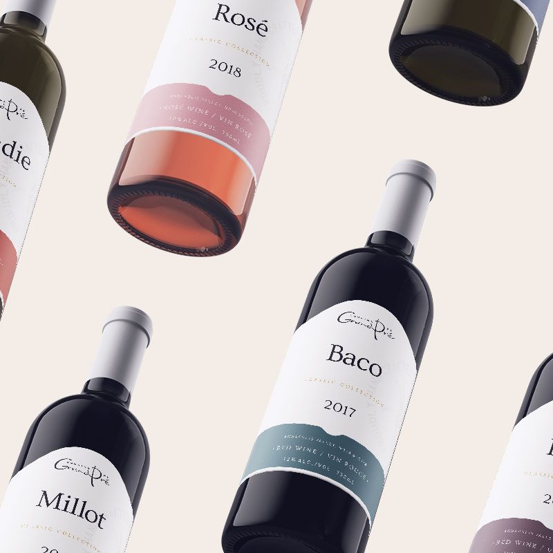
Domaine de Grand Pré
Domaine de Grand Pré
Domaine de Grand Pré
A bold stand-alone wine to introduce new flavours and styles
A bold stand-alone wine to introduce new flavours and styles
A bold stand-alone wine to introduce new flavours and styles
A bold stand-alone wine to introduce new flavours and styles
Art Direction
Production
Photography
Marketing
Art Direction
Production
Photography
Marketing
Art Direction
Production
Photography
Marketing
Art Direction
Production
Photography
Marketing
This project is in
partnership with
Able Sense
This project is in partnership with
Able Sense
This project is in partnership with
Able Sense
Domaine de Grand Pré released their first Moscato as their fresh bubbly product of the summer. This wine is also the first new release product after rolling out the newly redesigned Vintner’s Reserve and Classic Collection lines.
Domaine de Grand Pré released their first Moscato as their fresh bubbly product of the summer. This wine is also the first new release product after rolling out the newly redesigned Vintner’s Reserve and Classic Collection lines.
Domaine de Grand Pré released their first Moscato as their fresh bubbly product of the summer. This wine is also the first new release product after rolling out the newly redesigned Vintner’s Reserve and Classic Collection lines.
Domaine de Grand Pré released their first Moscato as their fresh bubbly product of the summer. This wine is also the first new release product after rolling out the newly redesigned Vintner’s Reserve and Classic Collection lines.
Domaine de Grand Pré released their first Moscato as their fresh bubbly product of the summer. This wine is also the first new release product after rolling out the newly redesigned Vintner’s Reserve and Classic Collection lines.
The initial discovery
The initial discovery
From the start, we knew this would be a stand-alone product, separate from their traditional method sparklings and other product lines, but it was unclear on the direction we would take. The label had to embody a young, fresh, and bubbly appearance while tying in with their other product lines. Through mood boarding and workshop sessions with the client, we explored several options.
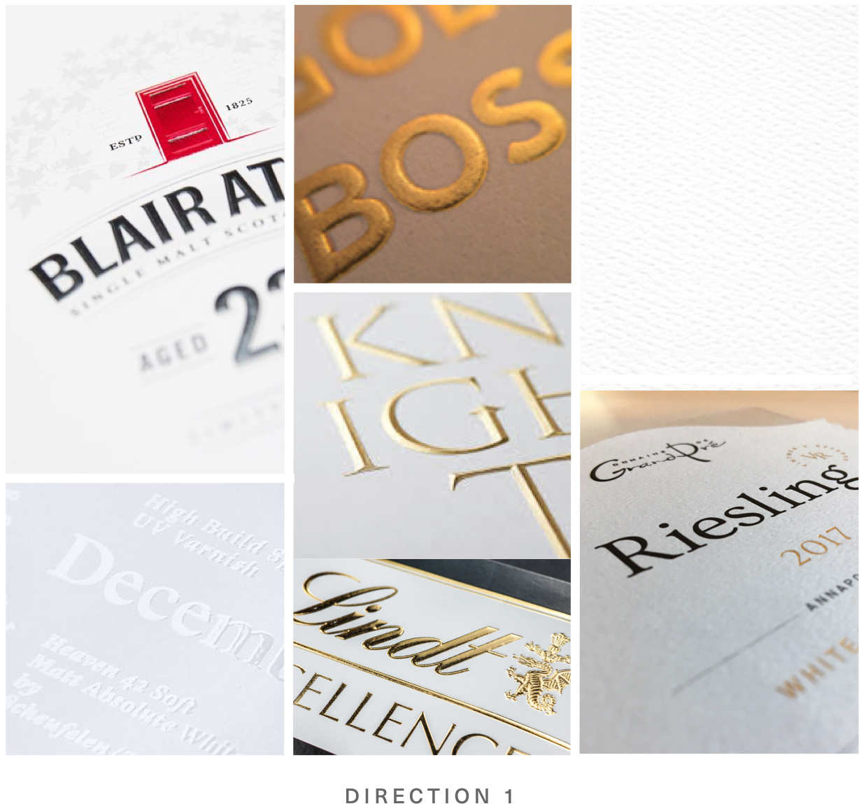
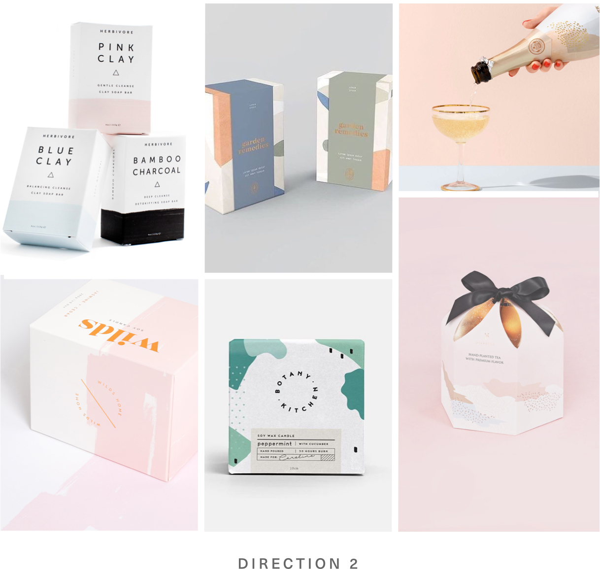
The simplistic black and gold approach had the minimalistic aspects but did not exude the bubbly youthfulness. Incorporating organic pink color blocks felt disconnected from their other lines.
From the start, we knew this would be a stand-alone product, separate from their traditional method sparklings and other product lines, but it was unclear on the direction we would take. The label had to embody a young, fresh, and bubbly appearance while tying in with their other product lines. Through mood boarding and workshop sessions with the client, we explored several options.
The simplistic black and gold approach had the minimalistic aspects but did not exude the bubbly youthfulness. Incorporating organic pink color blocks felt disconnected from their other lines.
Exploring new directions
Exploring new directions
Sitting down with the client, we decided to revisit the brief to review the requirements and realign the visions for the product. From this exercise, we created new mood boards to include likes and dislikes as well as potential marketing concepts. From these details, a new approach was created.
Sitting down with the client, we decided to revisit the brief to review the requirements and realign the visions for the product. From this exercise, we created new mood boards to include likes and dislikes as well as potential marketing concepts. From these details, a new approach was created.
The new design approach
The new design approach
The new design approach
The new design approach
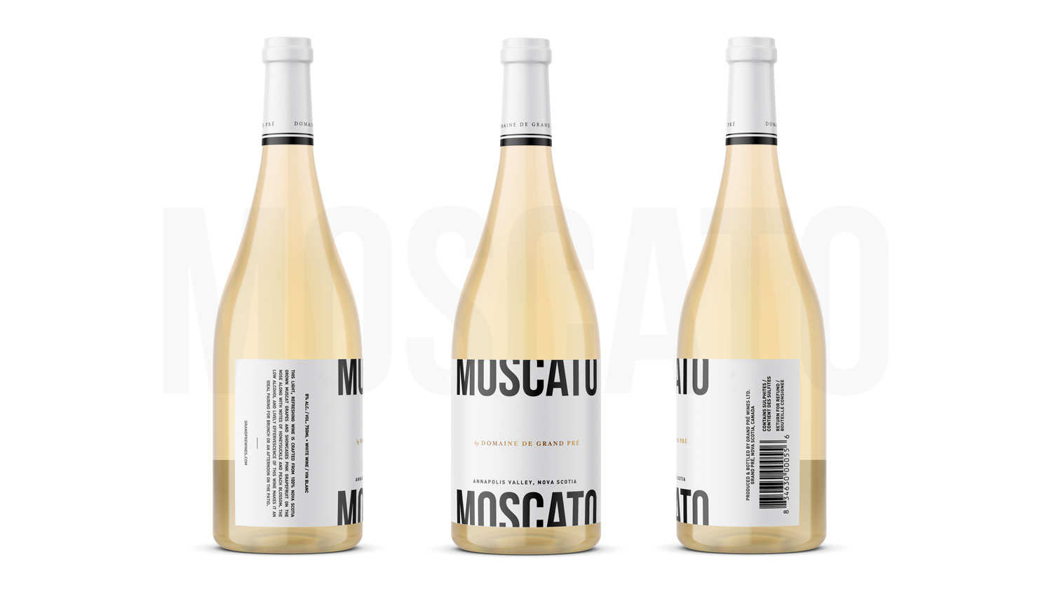
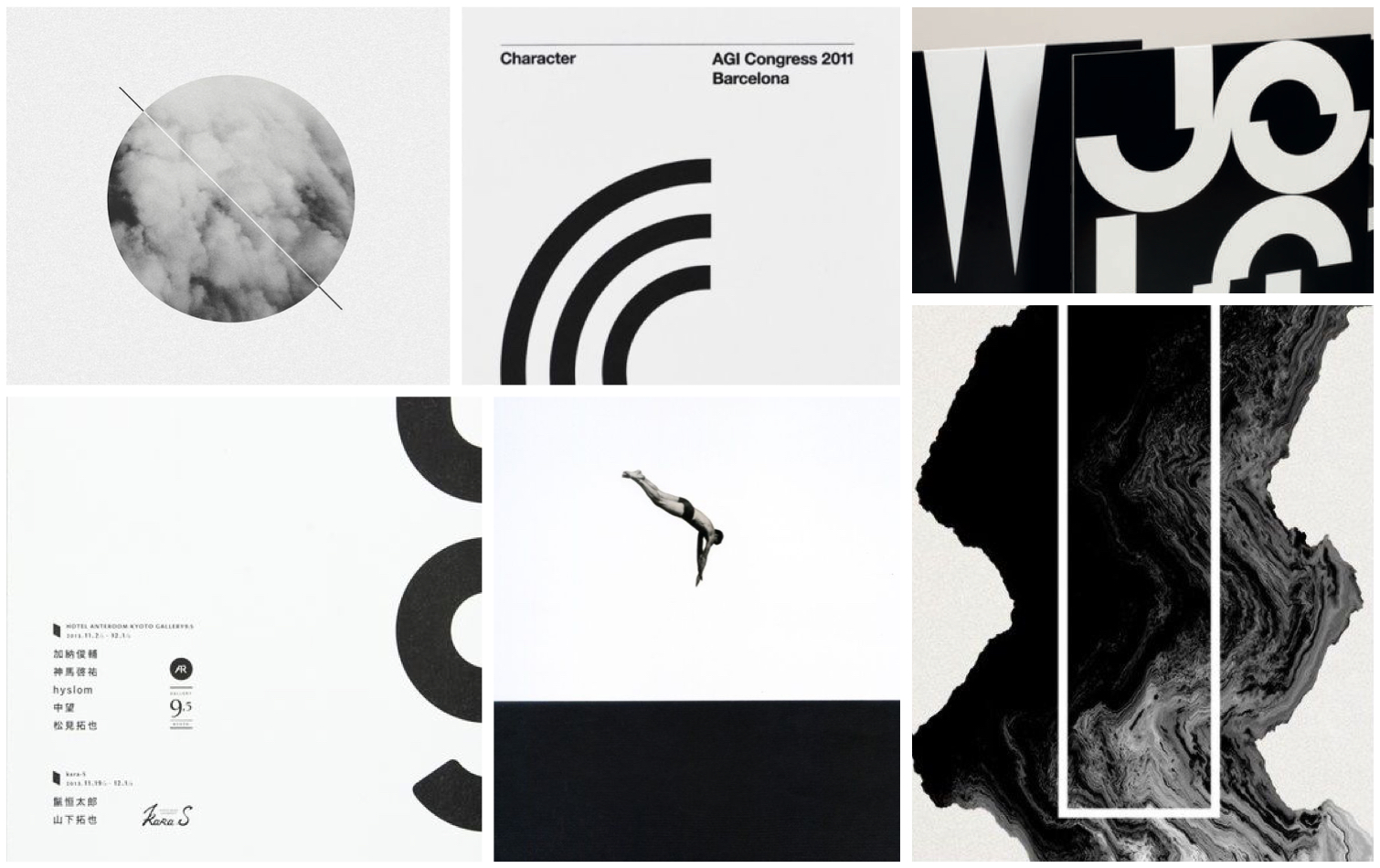
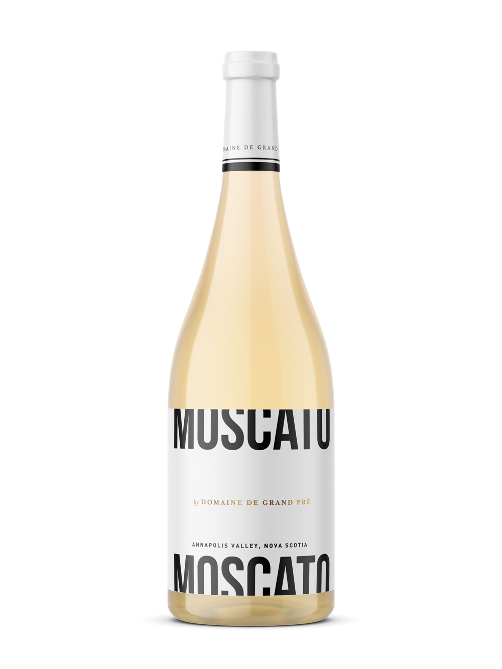
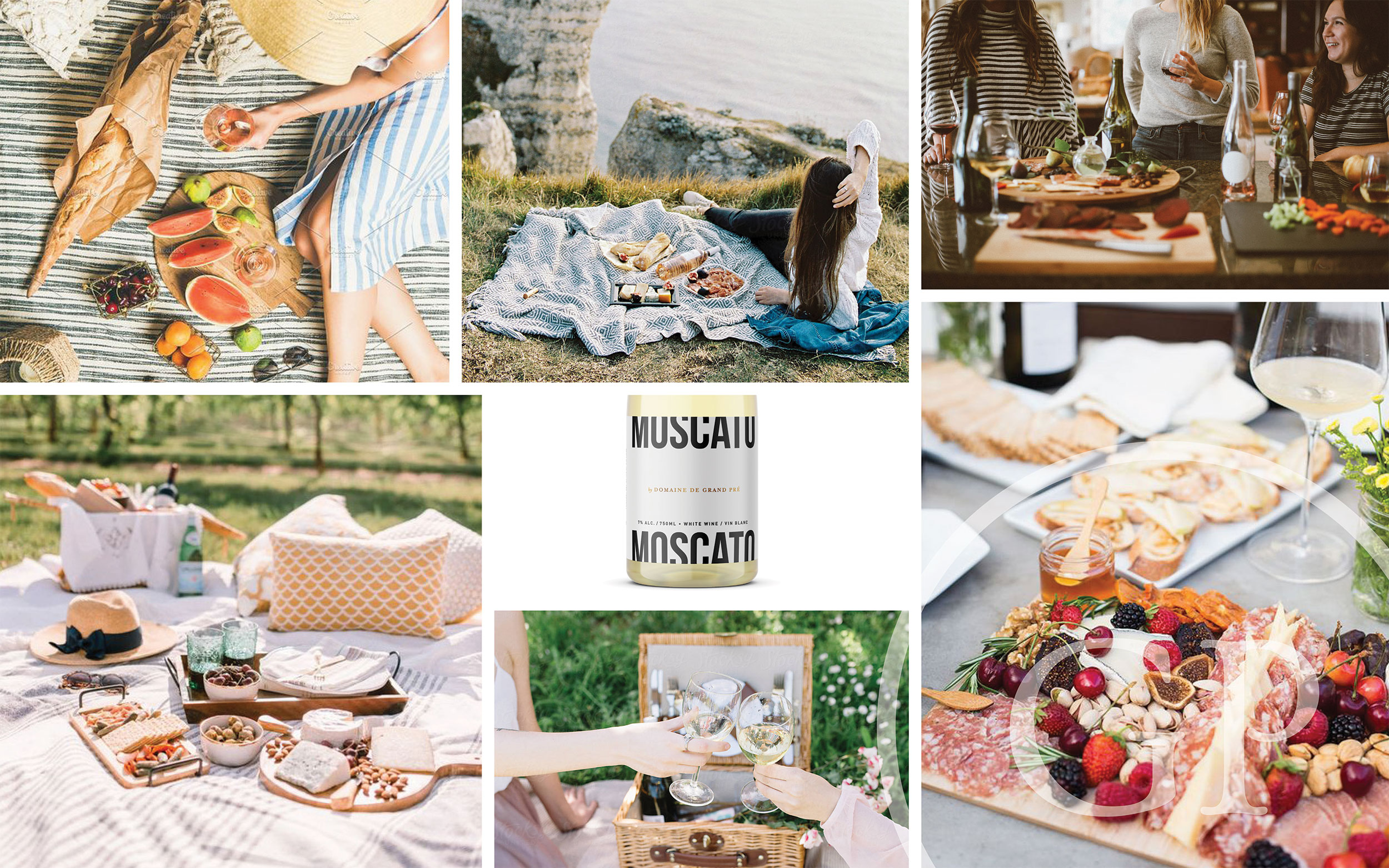
The new label was inspired by minimalistic black and white posters and Swiss design motifs. It was established that the label had to be bold with minimal color usage. The single rectangular die was introduced to cut down on printing costs and created a strong horizontal base for the typography. The linear version of their logo with the hot foil embellishment gave the label its hint of color and gave a nod to the sparkling product. Incorporating warm tones through marketing visuals brings a sense of youthfulness.
The new label was inspired by minimalistic black and white posters and Swiss design motifs. It was established that the label had to be bold with minimal colour usage. The single rectangular die was introduced to cut down on printing costs and created a strong horizontal base for the typography. The linear version of their logo with the hot foil embellishment gave the label its hint of colour and gave a nod to the sparkling product. Incorporating warm tones through marketing visuals brings a sense of youthfulness.
The new label was inspired by minimalistic black and white posters and Swiss design motifs. It was established that the label had to be bold with minimal colour usage. The single rectangular die was introduced to cut down on printing costs and created a strong horizontal base for the typography. The linear version of their logo with the hot foil embellishment gave the label its hint of colour and gave a nod to the sparkling product. Incorporating warm tones through marketing visuals brings a sense of youthfulness.
The new label was inspired by minimalistic black and white posters and Swiss design motifs. It was established that the label had to be bold with minimal color usage. The single rectangular die was introduced to cut down on printing costs and created a strong horizontal base for the typography. The linear version of their logo with the hot foil embellishment gave the label its hint of color and gave a nod to the sparkling product. Incorporating warm tones through marketing visuals brings a sense of youthfulness.
Official branded capsules
Official branded capsules
Official branded capsules
Official branded capsules
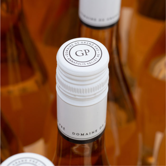
With the introduction of screw tops across their lineup, it was time to bring cohesiveness to their capsules. Domaine de Grand Pré’s custom capsules made their first debut for the release of the Moscato and will be introduced to all of their wine products.
With the introduction of screw tops across their lineup, it was time to bring cohesiveness to their capsules. Domaine de Grand Pré’s custom capsules made their first debut for the release of the Moscato and will be introduced to all of their wine products.
With the introduction of screw tops across their lineup, it was time to bring cohesiveness to their capsules. Domaine de Grand Pré’s custom capsules made their first debut for the release of the Moscato and will be introduced to all of their wine products.
With the introduction of screw tops across their lineup, it was time to bring cohesiveness to their capsules. Domaine de Grand Pré’s custom capsules made their first debut for the release of the Moscato and will be introduced to all of their wine products.
Related work
Domaine de Grand Pré / Custom Shopify Theme
Domaine de Grand Pré / Custom Shopify Theme
Domaine de Grand Pré / Classic Collection Labels
Teichert Gallery / Custom Shopify Theme
Let's talk
For work inquiries, feel free to get in touch with me hello@erinlee.design
For work inquiries, feel free to get in touch with me hello@erinlee.design
For work inquiries, feel free to get in touch with me hello@erinlee.design
© 2019 Erin Lee Design