Domaine de Grand Pré
Domaine de Grand Pré
Domaine de Grand Pré
Refreshing a standard line into a classic
Refreshing a standard line into a classic
Refreshing a standard line into a classic
Art Direction
Production
Photography
Marketing
Art Direction
Production
Photography
Marketing
Art Direction
Production
Photography
Marketing
Art Direction
Production
Photography
Marketing
This project is in
partnership with
Able Sense
This project is in partnership with
Able Sense
This project is in partnership with
Able Sense
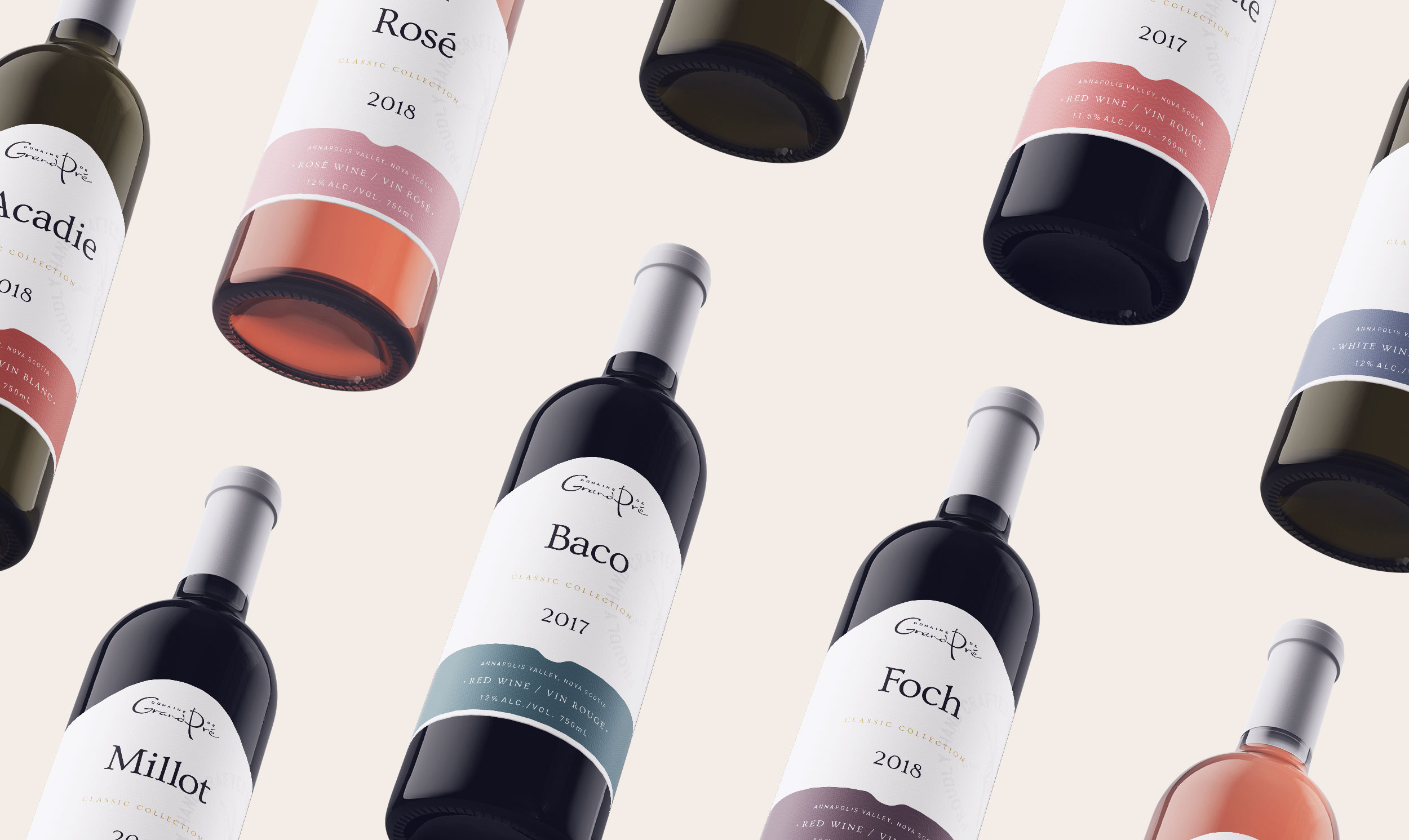
With Domaine de Grand Pré’s newly redesigned website and Vintner’s Reserve labels, the previously known ‘Standard Line’ was ready to be transformed into the fresh, approachable Classic Collection. And it's here to stay.
With Grand Pré’s newly redesigned website and Vintner’s Reserve labels, the previously known ‘Standard Line’ was ready to be transformed into the fresh, elegant and approachable Classic Collection. And it's here to stay.
With Grand Pré’s newly redesigned website and Vintner’s Reserve labels, the previously known ‘Standard Line’ was ready to be transformed into the fresh, approachable Classic Collection. And it's here to stay.
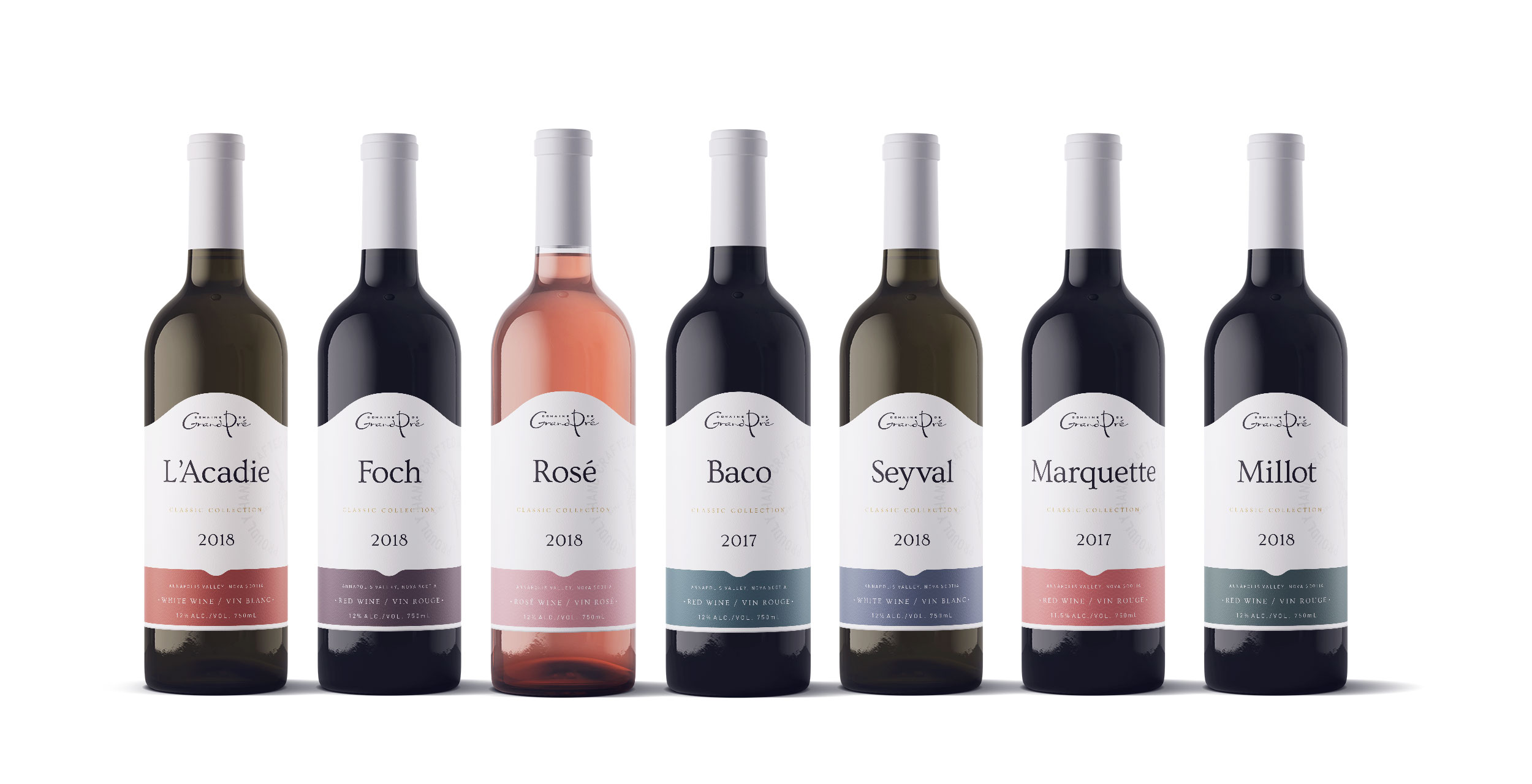
Revisiting the classics with a new direction in place
Revisiting the classics with a new direction in place
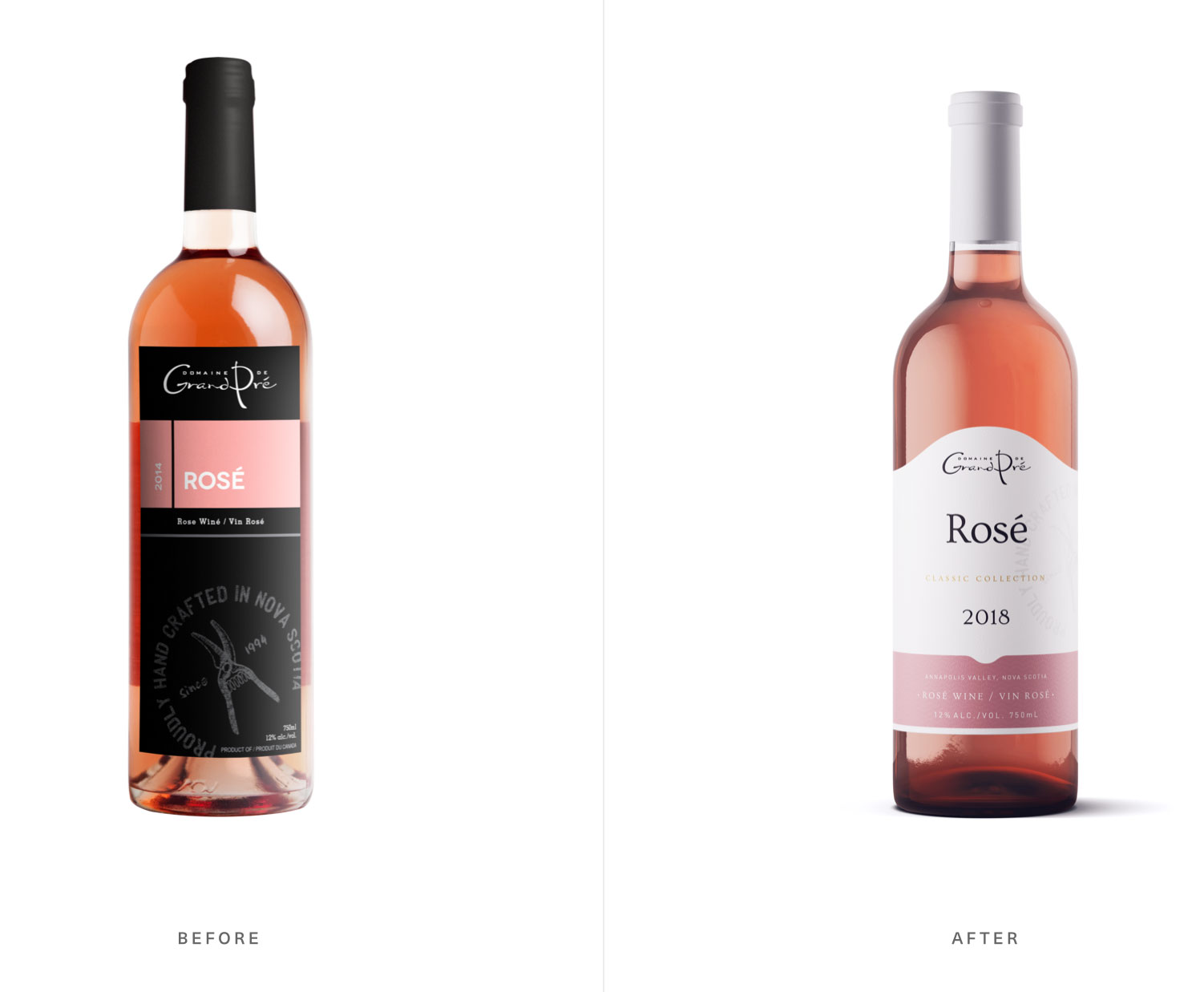
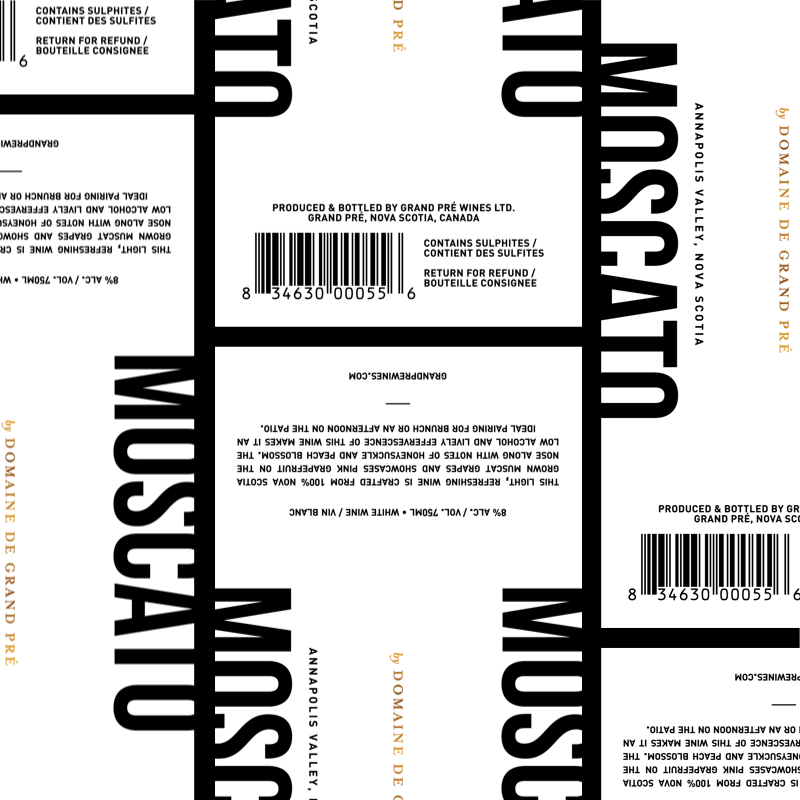
During the discovery phase, it was addressed that the fully black, rigid label was a main concern of the original. It didn’t stand out on the shelf and no longer tied in with their brand repositioning. This provided a great base from which to start the evolution.
During the discovery phase, it was addressed that the fully black, rigid label was a main concern of the original. It didn’t stand out on the shelf and no longer tied in with their brand repositioning. This provided a great base from which to start the evolution.
During the discovery phase, it was addressed that the fully black, rigid label was a main concern of the original. It didn’t stand out on the shelf and no longer tied in with their brand repositioning. This provided a great base from which to start the evolution.
Evolving into a simplistic and refined role
Evolving into a simplistic and refined role
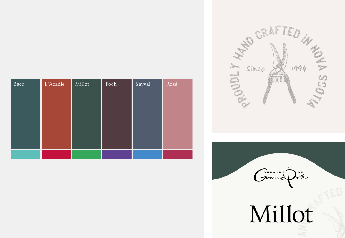
Inspired by Domaine de Grand Pré's website colors and the accent colors from the original label, a fresh palette was developed. Toning down the intensity of the colors helped unify the product lines and complemented the new tones.
Moving forward with a nod to the past
Domaine de Grand Pré has been a leading, innovative winery in Nova Scotia for over 20 years. Reintroducing the stamp spoke to their history and roots.
Creating a signature custom die for an organic feel
The arch-shaped label has become Grand Pré’s signature label shape, carried over from their Vintner’s Reserve line. The new shape paired with lighter colors transformed the label to tie in with their brand.
Related work
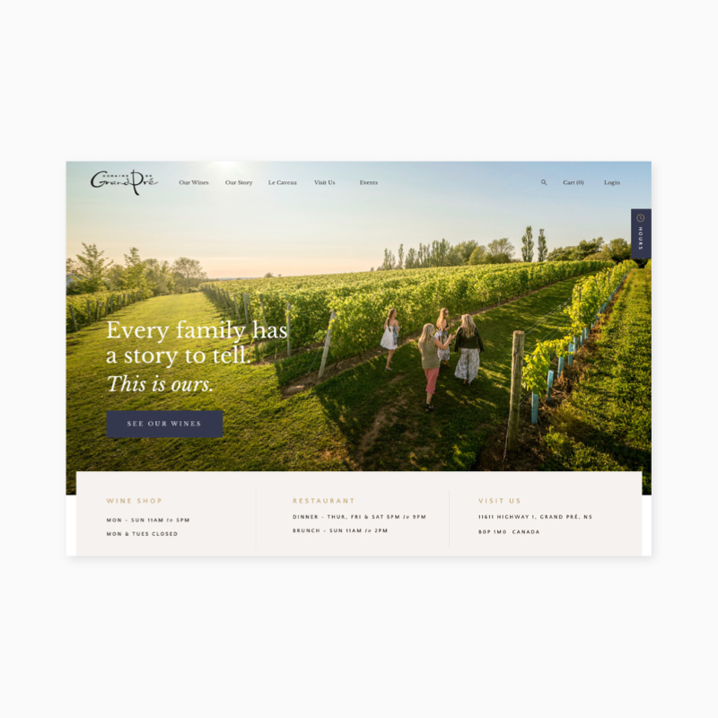
Domaine de Grand Pré / Custom Shopify Theme
Domaine de Grand Pré / Custom Shopify Theme
Let's talk
For work inquiries, feel free to get in touch with me hello@erinlee.design
For work inquiries, feel free to get in touch with me hello@erinlee.design
For work inquiries, feel free to get in touch with me hello@erinlee.design
© 2019 Erin Lee Design